At Websi, we believe a brand isn’t just how it looks – it’s how it feels. And the best brands don’t just “look good” — they connect, convert, and last. That’s why our design process starts before the first colour is chosen or font is set. It begins with understanding who we’re designing for.
Let’s walk through how we help our clients choose the right branding options and avoid the common pitfalls that can weaken even the most promising digital presence.
🔍 Deep Discovery: The Foundation of Great Branding
Before we touch a single pixel, we go deep into discovery. Our goal? To understand your audience better than your competitors do.
That means defining:
- Target personas: What are their challenges, goals and buying behaviours?
- Emotional drivers: What makes them trust, commit, or bounce?
- Usage habits: What devices they use, when they interact, and how long they stay.
From this, we define the brand tone, design direction, and the visual cues that resonate. A luxury SaaS platform aimed at CTOs will need very different branding choices to a playful DTC app aimed at Gen Z.
🎨 Colour Psychology: More Than Just Aesthetic
Colours carry emotional weight. We select colour palettes based on how you want users to feel when they engage with your brand:
- Blue: Trust, stability – ideal for SaaS or finance brands.
- Red: Urgency, excitement – good for action-heavy CTAs or campaign highlights.
- Green: Growth, calm – often used in health, sustainability, or fintech.
- Yellow: Optimism, attention – great for energising pages, but must be balanced.
- Black/White/Grey: Neutrality and clarity – excellent for modern or minimalist brands.
We also make sure CTA colours stand out from the rest of the design – guiding users to the actions that matter most.
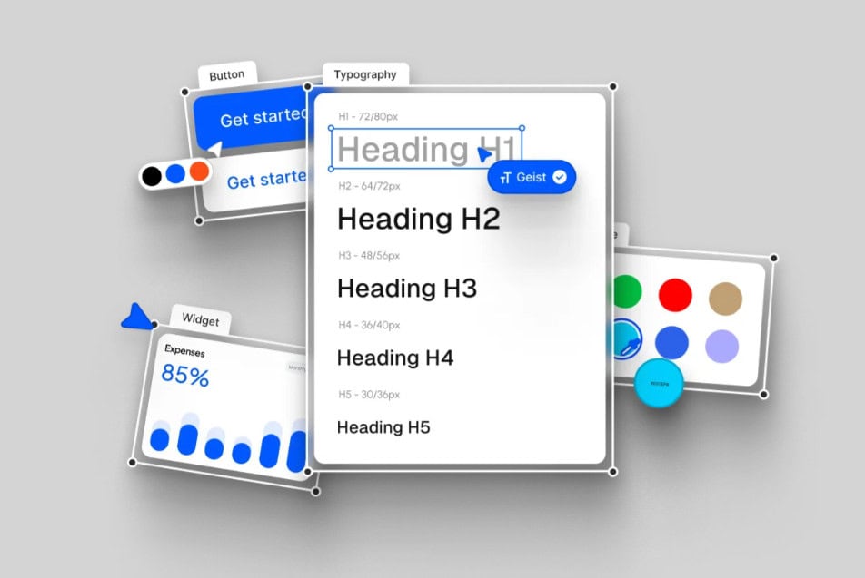
🔤 Typography: Clarity Meets Character
Fonts do more than make text readable — they set the mood.
A well-chosen font should:
- Reflect the brand’s personality (e.g. bold, elegant, minimal, technical).
- Be readable across all devices.
- Work seamlessly with headings, body text and buttons.
For example:
- Sans-serif fonts (like Inter or Helvetica) feel clean and modern.
- Serif fonts (like Georgia) suggest tradition or professionalism.
- Monospaced fonts (like Courier) are great for developer-focused brands.
We test typography not just in isolation, but across use cases — ensuring it enhances, not distracts.
📐 Layout Consistency: Spacing, Sizing & Alignment
A beautiful brand can fall apart quickly if the layout lacks consistency. That’s why we implement:
- Consistent spacing units to ensure rhythm and readability.
- Modular grids to support visual harmony.
- Predictable heading scales to help users scan content intuitively.
This consistency not only improves usability – it builds brand trust. It tells users: we care about details, and you can trust our product too.
🎯 CTA Colours: Guide, Don’t Confuse
A common mistake is underestimating the power of button colour psychology. CTAs must stand out, but also:
- Maintain brand contrast ratios (for accessibility).
- Visually separate primary actions (e.g. “Start Trial”) from secondary ones (e.g. “Learn More”).
At Websi, we apply contrast-tested, strategically chosen button colours that draw focus without overwhelming.
❌ Top 10 Website Branding Mistakes to Avoid
- Inconsistent heading sizes – breaks hierarchy and confuses the reader.
- Colour palettes applied without balance – leads to overwhelming or underwhelming visuals.
- Typography that doesn’t suit the content – either too playful, too serious, or unreadable.
- Poor contrast ratios – making text hard to read, especially for those with visual impairments.
- Clashing colours – e.g. red on green or purple on yellow, which are visually jarring.
- Too many colours – reduces cohesion and creates visual fatigue.
- Too many fonts – creates chaos and lacks professional polish.
- Inconsistent CTA styles – undermines action confidence.
- Unbalanced spacing and alignment – ruins flow and usability.
- Ignoring responsive behaviour – what works on desktop might fall apart on mobile.
💡 Final Thought
Great branding doesn’t happen by accident — it’s a deliberate, informed process rooted in audience insight and strategic design choices. At Websi, we combine creativity with consistency to build brands that not only look stunning but also perform.
Let’s craft a brand that speaks volumes — visually and strategically.
👉 Talk to Websi about your branding project today.