💡 Why UX Is Your Secret Conversion Weapon
Your website is your most powerful sales tool — but only if it’s built around your users. At Websi, we combine design, psychology and data to engineer experiences that guide users seamlessly from curiosity to conversion.
Forget flashy gimmicks. Real UX design is invisible. It works by reducing friction, building trust, and making the next step obvious. That’s how you move the metrics that matter.
🧭 What Does “Conversion-Driven UX” Actually Mean?
It means designing every element of the site to serve a clear purpose — usually one of these:
- Educate and engage
- Build confidence and credibility
- Nudge towards action
- Reduce barriers to entry
Every scroll, button, headline and section needs to earn its place.
🔍 Key UX Principles We Apply at Websi
We apply tried-and-tested UX principles to help users flow through your site effortlessly:
1. Visual Hierarchy
Guide the eye with typography, spacing, and design weight.
Read: Nielsen Norman Group – Visual Hierarchy Principles
2. Consistent CTA Patterns
Primary CTAs use bold, consistent colours and positions. Secondary CTAs are subdued.
3. Fewer Choices, Better Outcomes
The paradox of choice is real. More options = more hesitation.
Read: Hick’s Law in UX
4. Scroll Psychology
The fold isn’t dead – but mobile users scroll more. We space content to guide attention downward in deliberate steps.
5. Responsive by Default
We build mobile-first, not mobile-also. It’s not just about resizing — it’s about re-prioritising the user journey for thumb-driven interfaces.
🎯 The 7 UX Features That Actually Drive Conversions
Here’s what we design into nearly every project:
- Sticky CTA or nav bar (especially for SaaS landing pages)
- Social proof placed just before decision points
- Expandable content to handle objections without bloating the layout
- Predictable form design – short, clear, with no confusion
- Directional cues (arrows, images looking toward CTAs)
- Contrast and colour to focus attention
- Accessible font sizes and padding
❌ 5 UX Mistakes That Kill Conversions
Even the most beautiful websites fail if they frustrate users. Common issues we fix:
- Buttons that aren’t clearly clickable
- Mixed messaging or too many CTAs per section
- Inconsistent spacing or heading sizes
- Forms that ask for too much, too soon
- Load speeds over 3 seconds (which kills mobile UX)
📚 Read: Google UX Playbooks for Best Practice
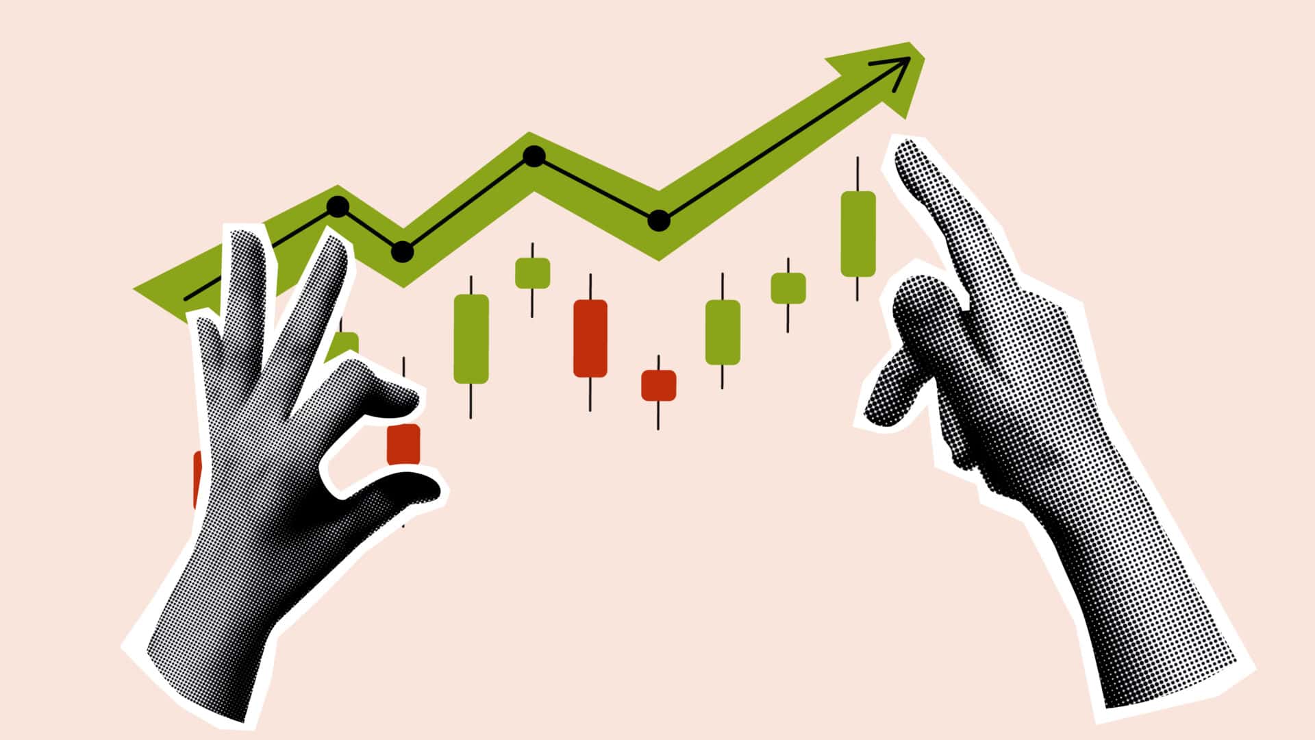
📈 What Happens When UX Is Done Right?
Clients see:
- 30–70% increase in conversions
- Longer time on site
- Lower bounce rates
- More leads from existing traffic
And the best part? These improvements compound over time.
🔧 UX + CRO + Strategy = What Websi Delivers
User experience isn’t just “design”. It’s your conversion strategy in visual form.
We craft websites that make sense to the user and move the needle for your business — grounded in best practice and elevated by creative execution.
👉 Let’s talk about optimising your UX and turning your traffic into action.